- OneStream Community
- News & Views
- ONECommunity Blog
- What in the World is a Sankey Diagram?!?!?
- Subscribe to RSS Feed
- Mark as New
- Mark as Read
- Bookmark
- Subscribe
- Printer Friendly Page
- Report Inappropriate Content
The second-hardest thing about writing a book is getting yourself to stop typing (the hardest thing, of course, is getting started). Particularly when the book in question covers a topic as broad and deep as OneStream Advanced Reporting and Dashboards, and when the underlying platform is as rich, powerful, and ever-growing as OneStream. If we had waited to say “we’re done” until every concept, component, and technique had been thoroughly explored, we would never have finished the book!
There’s one relatively new Dashboard component that I would have loved to have covered – we didn’t have the chance to take a deep look at it in the book, so I’ll give it a go here.
It’s called a Sankey Diagram. And not only do Sankey Diagrams look really cool, they give me a great excuse to go a little deeper into Dashboard Dataset and XFBR Business Rules, too!
What’s a Sankey Diagram?
If that term isn’t familiar, the concept might be. A Sankey Diagram is a type of data visualization that shows the flow of values from sources to destinations using bands that divide and merge at specified nodes in the process. The thickness of each band represents the relative magnitude of the value at that point. (These diagrams go back much further than you might expect – the Wikipedia article shows examples from the 1800’s depicting topics as diverse as military troop movements and steam engine efficiency!)
Sankey Diagrams in OneStream Dashboards
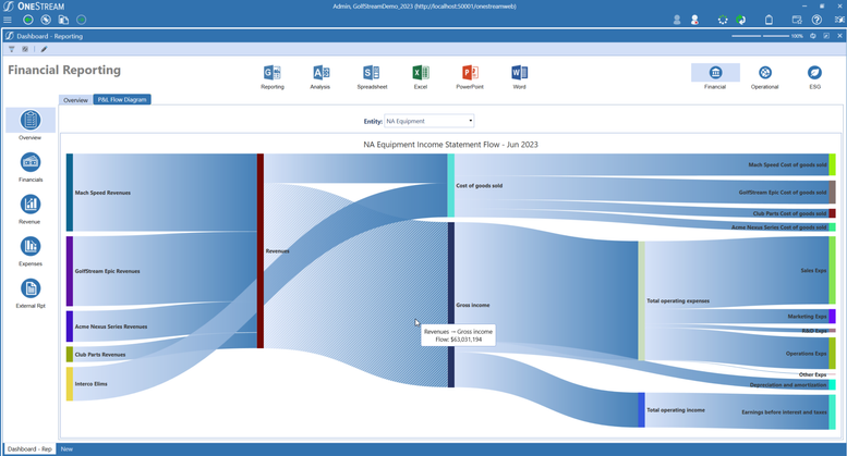
In the world of CPM, Sankey Diagrams can give very clear visual representations of the flow of funds through various processes or dimensions. Here’s an example from OneStream’s standard demo application showing the flow through the Income Statement from Total Revenue to Cost of Sales, Gross Income, Operating Expenses, and Net Earnings:
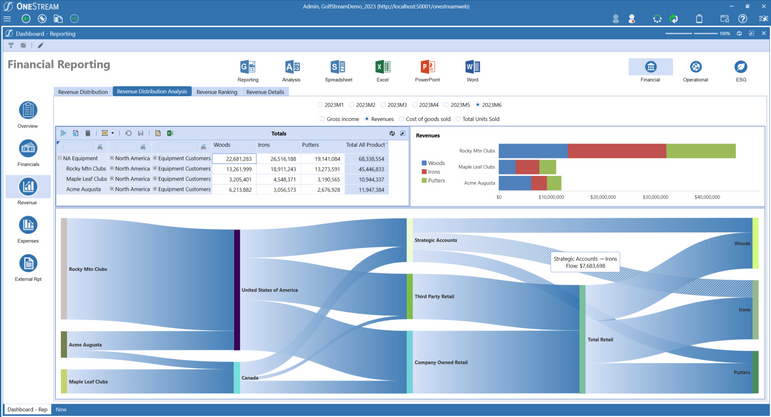
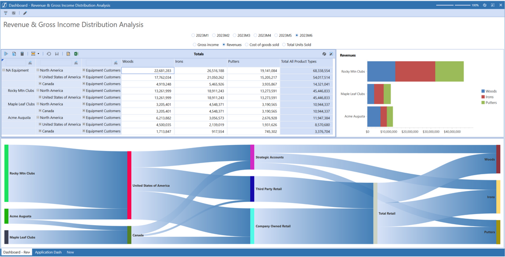
Sankey Diagrams are also a great way to visualize values from the perspective of multiple dimensions or attributes at a glance. Here’s an example that allows the user to see Gross Income, Revenue, Units Sold, or Cost of Sales from the perspective of Legal Entities (e.g., Rocky Mountain Clubs), Regions (e.g., Canada), Sales Channels (e.g., Third Party Retail), and Product Category (e.g., Putters) – all at the same time:
Each of these breakdowns adds up to the same total, but the Sankey Diagram lets us see clearly how these different perspectives relate to each other, and how those relationships change over time.
So how do we configure these diagrams in OneStream? Conceptually, they are very similar to Chart components – as with Charts, we use a Dashboard Data Adapter to gather the data, and attach that Data Adapter to a Dashboard component.
Sankey Diagram components have far viewer properties to configure than Chart components, though. That’s because with Sankey Diagrams, most of the heavy lifting is performed by a Dashboard Data Set Business Rule. Using this rule, we define each of the links in our diagram (that is, the stripes showing the flow from point to point), the source and target nodes where these links come together and split apart, and the data values for each link in the diagram.
Let’s walk through the business rule used to gather the data in the example above.
The Dashboard Data Set Business Rule
There are probably as many ways to write any Business Rule as there are rules to be written, but here's how I approached it. Let's look at the five main "chunks" of the rule.
1: The Basic Structure of the Rule
Dashboard Data Set rules typically begin with a Select Case statement to organize the rule by Function Types (in our case, the function type we will be using is “GetDataSet”). Then, within the GetDataSet function type, there will be an IF statement to identify the application-specific Data Set being retrieved (the “DataSetName”). We will call our Data Set “SankeyData”:
The very first thing our SankeyData rule will do is retrieve any parameter values that were passed to this rule by the Dashboard – in our case, we will allow the user to select which Account and Time Period to display:
The Sankey Diagram component will be expecting data in a very specific format, with each link defined by three things: a Source, a Target, and a Value (each link can also be given a Parameter Value – we’ll discuss that later). For every Source and Target combination defining a link, we will use these members when retrieving the associated Values from the cube. When displayed on our Dashboard, each link’s Value will determine its relative thickness.
2: Organizing our Metadata in a Data Table
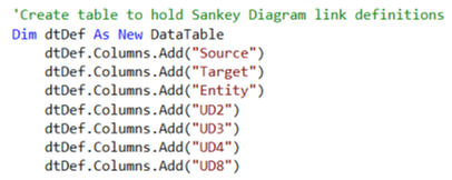
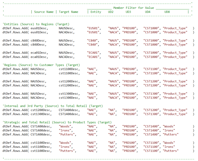
To prepare our data, we will define a DataTable in our rule with columns for each link's Source, Target, and the member names for the dimensions that will vary in the member filter we will use to retrieve each link’s Value:
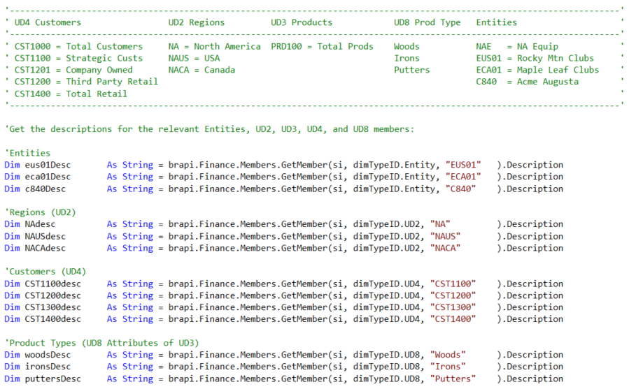
When defining our link value member filters, we will need to use the member names for each dimension. But, for the Source and Target text that will be displayed on the Dashboard, we might prefer to use the member descriptions – in this example, we will retrieve those descriptions for each of the relevant members that will be defining our links:
Now, we can load the data table with one row for each of the links we will include on our Sankey Diagram:
3: Retrieving the Data Values and Assembling the Sankey Item List
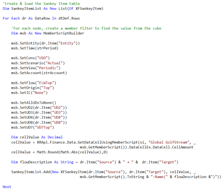
For each row in our data table, we will (1) use its assigned member names to assemble a full member filter, (2) retrieve the cell value at the intersection defined by that member filter, and (3) load that Value along with the row’s Source and Target names to a list of objects called “XFSankeyItems”:
4: Taking Advantage of the Sankey Diagram’s Bound Parameter
With OneStream's Sankey Diagram component, we can define an action to perform if the user clicks on a link.
For each of the SankeyItems in our SankeyItemList, in addition to the Source, Target, and Cell Value, we can also included an optional fourth parameter. This fourth parameter defines what will be contained in the Sankey Diagram's Bound Parameter if a link is clicked.
For our Dashboard, we will open a dialog box with a Cube View focused on the clicked link’s cell value. We’ll take a closer look at how we might configure this Cube View later, but for now, since the member filter contains everything we need to know to about the POV of the cell value for the clicked link, we'll include it as the SankeyItem's Bound Parameter.
In this example, I have also appended a “:Name()” extension to the member filter with the Source and Target names concatenated by a “ → ” symbol.
(Fun fact: To type symbols like the → as well as emojis and lots of other stuff directly from your keyboard, just hold down the “Windows” button and click the period key – a dialog box will appear with hundreds of special characters that you can then copy and paste!)
5: Assembling the Sankey Collection and Passing it Back to the Dashboard
Finally, our complete list of SankeyItems is assembled in a SankeyCollection which is used to create the DataSet that is returned to the Dashboard Data Adapter. This gives our Data Adapter everything it needs to know to populate our Sankey Diagram:
Configuring the Dashboard Data Adapter and Sankey Diagram Component
Now that we have our Dashboard Dataset Business rule ready to go, we can set up our Data Adapter and Sankey Diagram component. For the Data Adapter, we set the Command Type to Method, the Method Type to BusinessRule, and the configured the Method Query to call our business rule (OSBLOG_SankeyData2), specifying the function we will use within that rule (SankeyData), and passing in the Dashboard parameters containing the user-selected Period and Account:
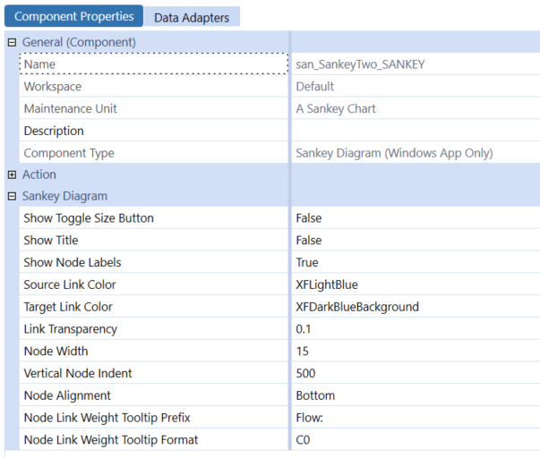
The Sankey Diagram component itself only needs a handful of cosmetic properties like Source and Target Link Colors, as well as formatting for the Source, Target, and data values that are displayed when the user hovers their mouse over a specific link.
Here’s how I configured these settings:
(Tip: Number formats in OneStream, such as the Node Link Weight Tooltip Format, conform to the Microsoft .NET standard syntax. This includes various format specifiers like N for Number, P for Percent, and C for Currency. With the Tooltip Format set to “C0”, the value will be displayed with no decimal digits, and will show the currency symbol and decimal and thousands separators appropriate to the current user’s Windows Culture setting.)
And, of course, we have attached our Data Adapter to the Sankey Diagram’s Data Adapters tab:
Using the techniques described in OneStream Advanced Reporting and Dashboards (see chapters 10-14), we can now configure a Dashboard with radio buttons for Time and Account selections, a Cube View showing the summarized raw data, a simple stacked bar chart, and of course the star of the show, our Sankey Diagram:
Looks pretty good! But wouldn’t it be nice if we could easily see the underlying detailed data for one of these links that captures our attention….?
Using the Bound Parameter
Earlier, I mentioned that along with the Source, Target, and Value, we have also included the member filter for each value as the link’s Bound Parameter value. We can now use this Bound Parameter to dynamically configure a Cube View that will show the detail specific to any link that is clicked.
To configure this Cube View, it will be useful to break the full member filter into its individual parts. For example, we might click on a link that provides this member filter as its Bound Parameter:
A#Revenue:U1#None:U2#Northeast:U3#StrategicAccounts:U4#TotalCustomers:Name("Northeast → Strategic Accounts")
But, when displaying our Cube View, we would like to have individual nested rows and/or columns with member expansions using the components of that member filter - maybe something like this:
A#Revenue.ChildrenInclusive
U2#Northeast.Tree
U3#StrategicAccounts.Tree
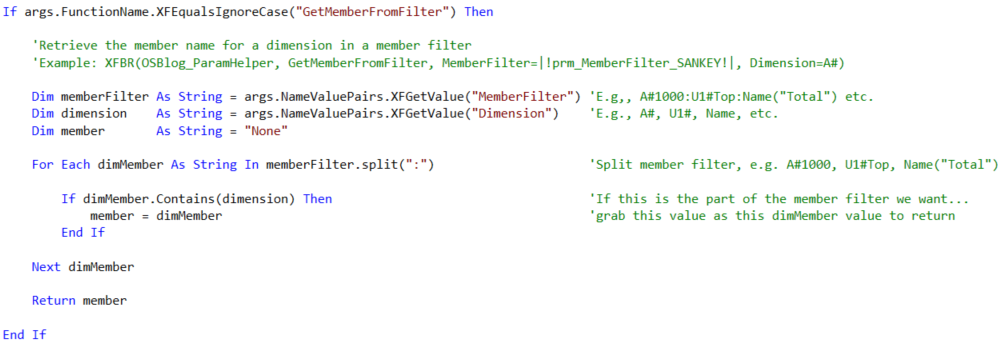
To accomplish this, we can use a simple Dashboard XFBR String Business Rule. Here’s what the rule looks like:
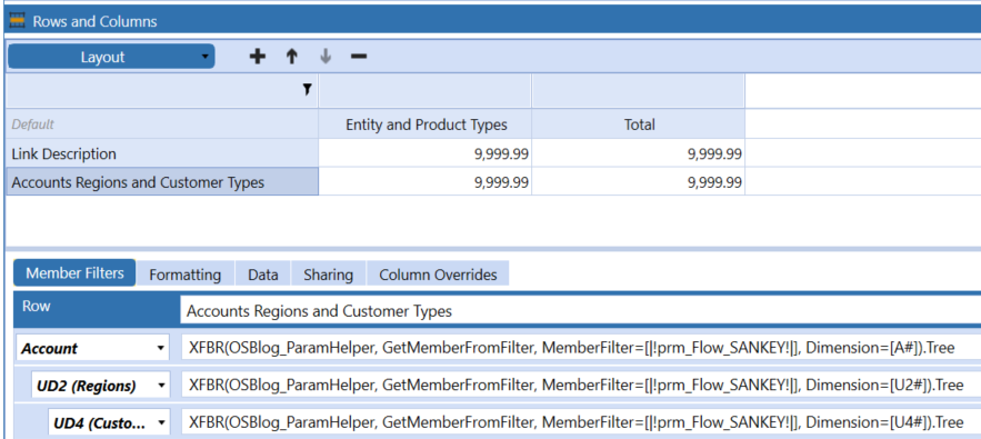
And, here’s how that rule is used by the Cube View’s Row definition. For each of the three nested dimensions in the row, we pass our XFBR rule the current value of our Bound Parameter (which contains the clicked link’s full member filter) and the dimension token for the member we want to retrieve (e.g., “A#” for the Account member):
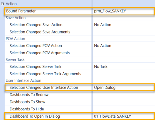
Now, on the Sankey Diagram component, we can configure the User Interface Action settings to open a simple Dashboard we have set up to display this Cube View in a dialog box:
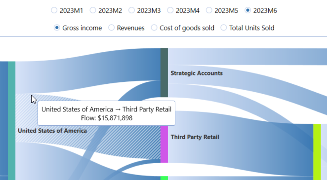
Let’s take another look at a link on the Sankey Diagram as displayed on the finished Dashboard – notice the Tooltip showing the Source, Target, and Value for the link our mouse is pointing to:
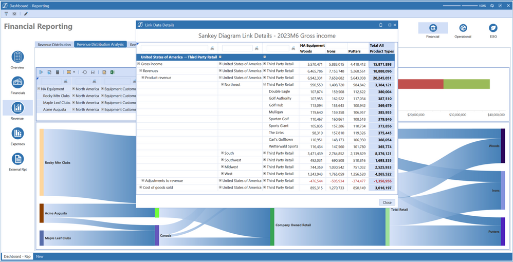
And here’s the dialog box that opens when we click that link – the Cube View rows use our XFBR rule to dynamically select the members for each dimension as appropriate to this specific link, and the “grand total” in the upper right corner of the Cube View is equal to the value displayed in the clicked link’s Tooltip:
And we’re done! Let's look back, and see what we did:
- We created a Dashboard Dataset Business Rule to collect and organize the information we need.
- We attached that rule to a Dashboard Data Adapter which we used to populate a Sankey Diagram Component.
- We created a Dashboard XFBR String Business Rule to retrieve any dimension member from a member filter.
- We used that rule to dynamically configure a Cube View to show all the details behind any clicked link in our Sankey Diagram.
Everything else on the Dashboard was configured using the same components, techniques, and design concepts that you can learn all about in OneStream Advanced Reporting and Dashboards, available now in print or pdf from Amazon, Barnes and Noble, or wherever fine books are sold!
You must be a registered user to add a comment. If you've already registered, sign in. Otherwise, register and sign in.
